Documentation
Button / Lamp
Buttons can turn bit devices on and off and indicate the status of the bit device as a lamp.
(If no button device is specified, it behaves like a lamp.)
You can also move pages and switch projects.
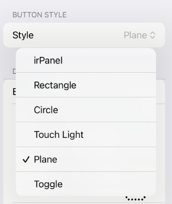
Style
Style specifies the button’s style.
-
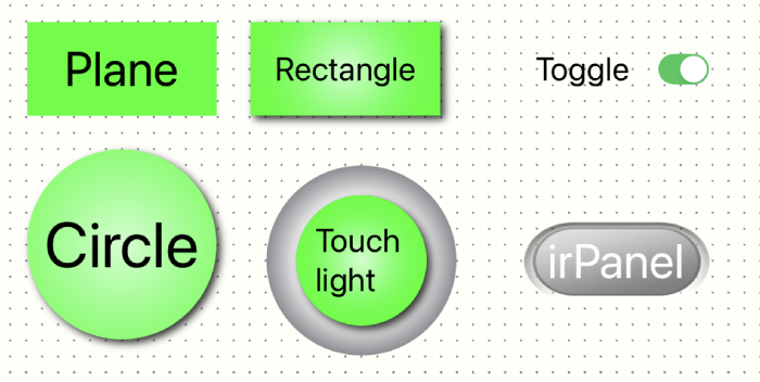
irPanel
This is the button style used in our iOS app, irPanel. -
Rectangle
It is rectangular in style and comes with a shadow. -
Circle
It is round in style and comes with a shadow. -
Touch light
It is a touch-light style with a lamp in the center that casts a shadow. -
Plane
Rectangle style, no shadow. Buttons can be transparent. When a button is added, it is created as plain. -
Toggle
This is a standard iOS toggle button.
Device
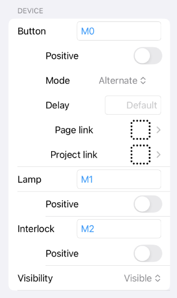
In the device section, you can set devices to turn on or off when buttons are pressed, display devices as lamps, and so on.
-
Button
Specify the device to turn on or off when the button is pressed. If you do not specify a device, it will only function as a lamp. -
Positeve logic
When the mode is Momentary, the specified device is turned on when the button is pressed. For other modes, see the mode description. -
Negative logic
When the mode is Momentary, the specified device is turned off when the button is pressed. For other modes, see the mode description. -
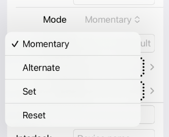
Mode
Specifies the ON/OFF behavior for the specified device when the button is pressed. The following describes the behavior in the case of positive logic. In the case of negative logic, ON/OFF is reversed. -
Momentary
When the button is pressed, the specified device turns on; when the button is released, it turns off. -
Alternate
Each press of the button reverses the ON/OFF state of the specified device. -
Set
Press the button to turn on the device. -
Reset
Press the button to turn off the device. -
Delay
Sets the time in seconds between button presses and responses. If not set, the default value from the project settings will be used. Since iOS devices respond immediately when touched, the project defaults to a 0.3-second delay in response to prevent accidental touches and misoperation.
For a faster response, set a shorter delay. -
Page link
Select the page to which you want to move when you press the button. Once selected, the page list screen will display, and the target page will be selected. If the Lite edition has limited functionality, it will not work properly. -
Project link
Select the project to which you want to move when you press the button. Once selected, the project list screen will be displayed, and the target project will be selected. If the Lite edition has limited functionality, it will not work properly. -
Lamp
Specify the device that turns the button lamp on and off. -
Positive
If the specified device is ON, it is displayed with the text and colors specified in Active; if it is OFF, it is displayed with the contents of Inactive. -
Negative
If the specified device is OFF, it is displayed with the text and colors specified in Active; if it is ON, it is displayed with the contents of Inactive. -
Interlock
Enables or disables the button on the specified device. -
Positive
Enabled when the specified device is on. -
Negative
Enabled when the specified device is off. -
Visibility
Specify whether to show or hide the button. See Common Properties.
Title
Specify the text that should appear on the button.
-
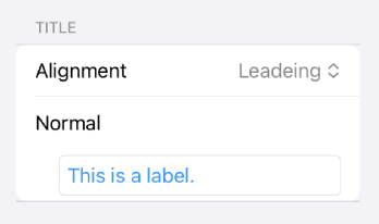
Alignment
Specifies the alignment of text. -
Normal
Specifies the text to be displayed (when the lamp device is not specified). -
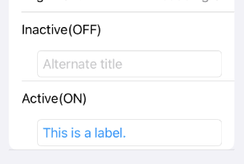
Inactive
Specifies the text if the device specified by the lamp is inactive. It can be omitted if the display is the same for both active and inactive. -
Active
Specifies the text if the device specified by the lamp is active. It can be omitted if the display is the same for both active and inactive.
Font
Specifies the font of the text.
-
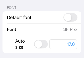
Default font
When turned on, the default font is used, and the font size is adjusted to fit the width. -
Font
Specify the font. -
Auto size
When turned on, the text size is adjusted to fit the width. -
Font size
Turning auto size off allows you to specify the text size. Adjusting the font size, label width, and height will cause the text to wrap.
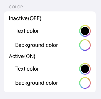
Color
Specify the background and border colors of the text.
Specify the background and border colors when inactive or active.
Confirmation
The
bulb icon
in the top toolbar shows you how it looks.
